Street food is a rapidly growing trend. It is no longer just about what is served; it is about the entire experience. Fast-paced, bold and full of personality, every detail matters—from the food itself to the way it is presented. That is where Caramba comes in.
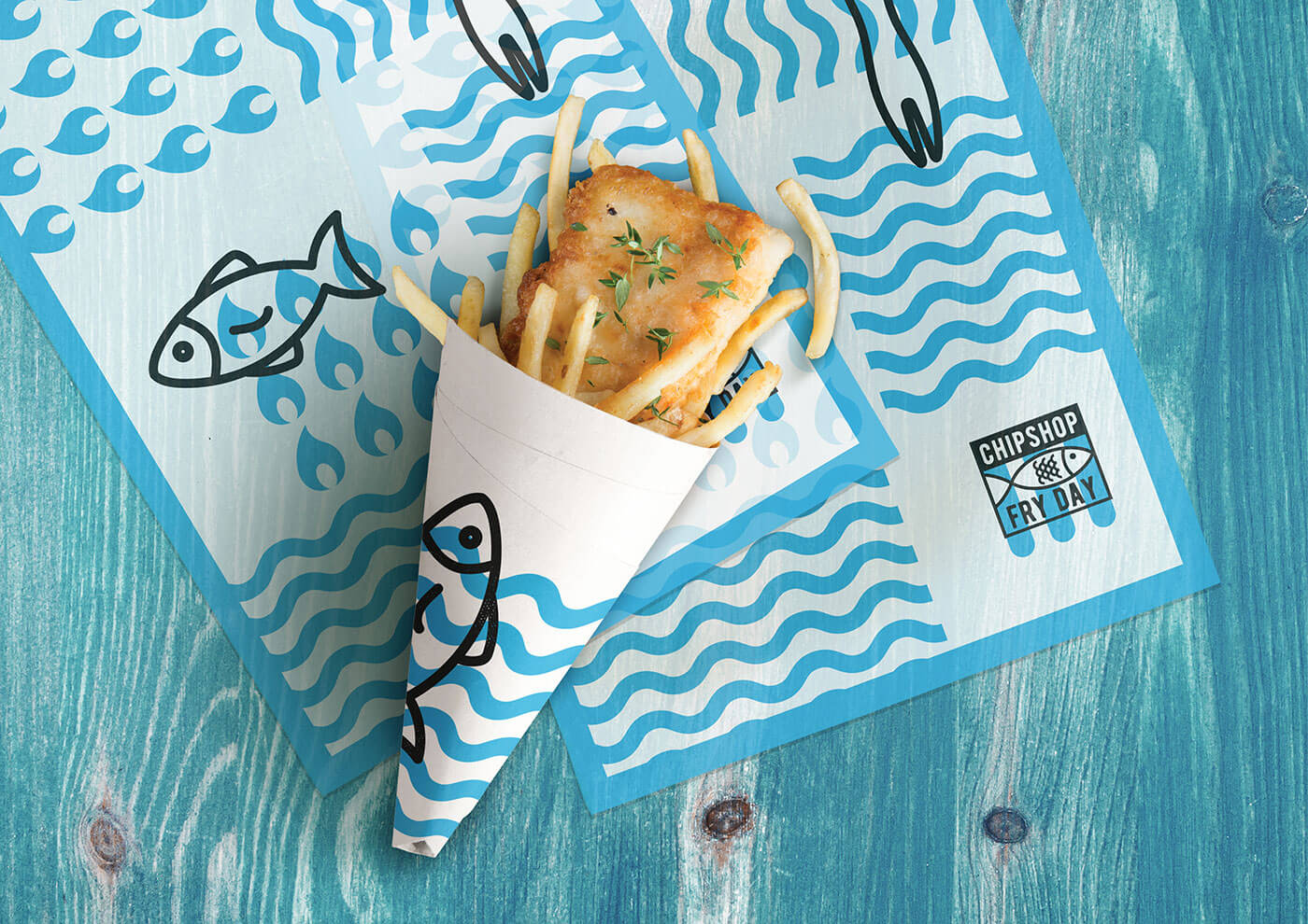
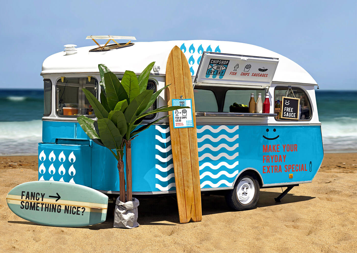
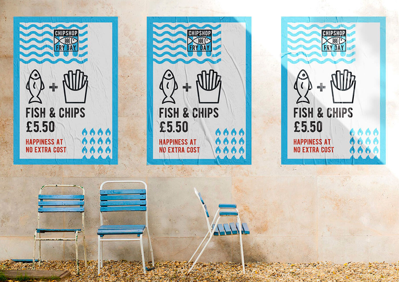
Chipshop Fryday approached us to create a fresh brand identity and packaging that would position the business firmly within the street food market. The concept brings together the familiarity of the traditional British chip shop with the energy of a modern street food brand. A bold blue palette creates instant recognition, while crisp white stripes evoke seaside awnings, striped deckchairs and classic fish-and-chip wrapping. The result feels nostalgic without appearing dated: distinctive, playful and designed to stand out in a busy food-led environment.
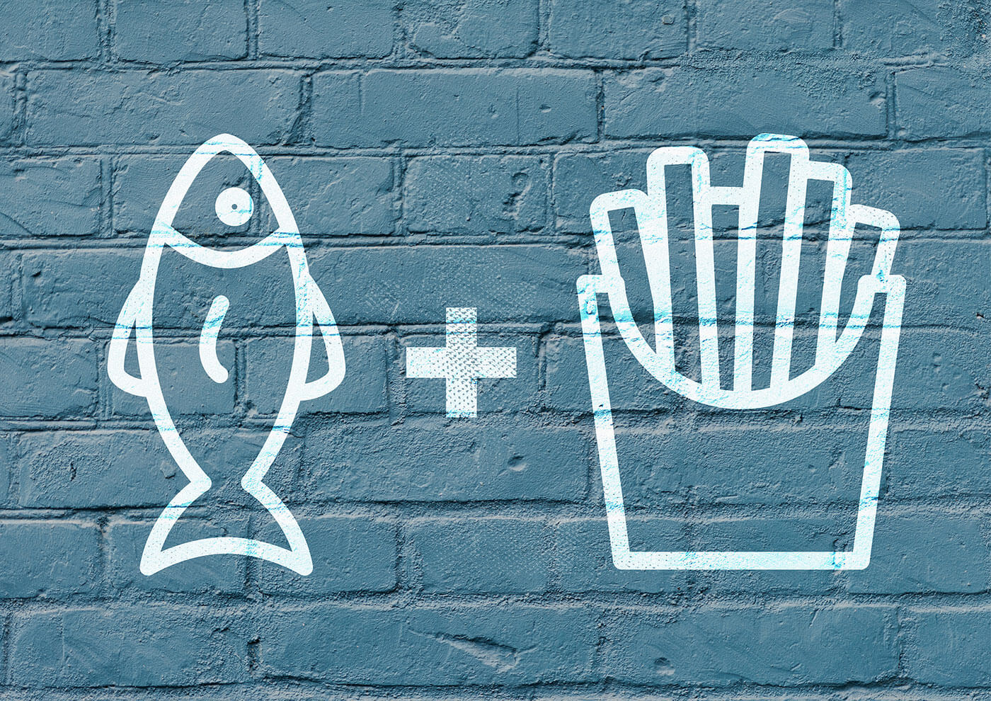
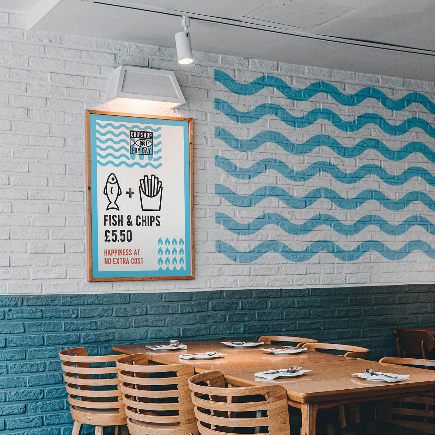
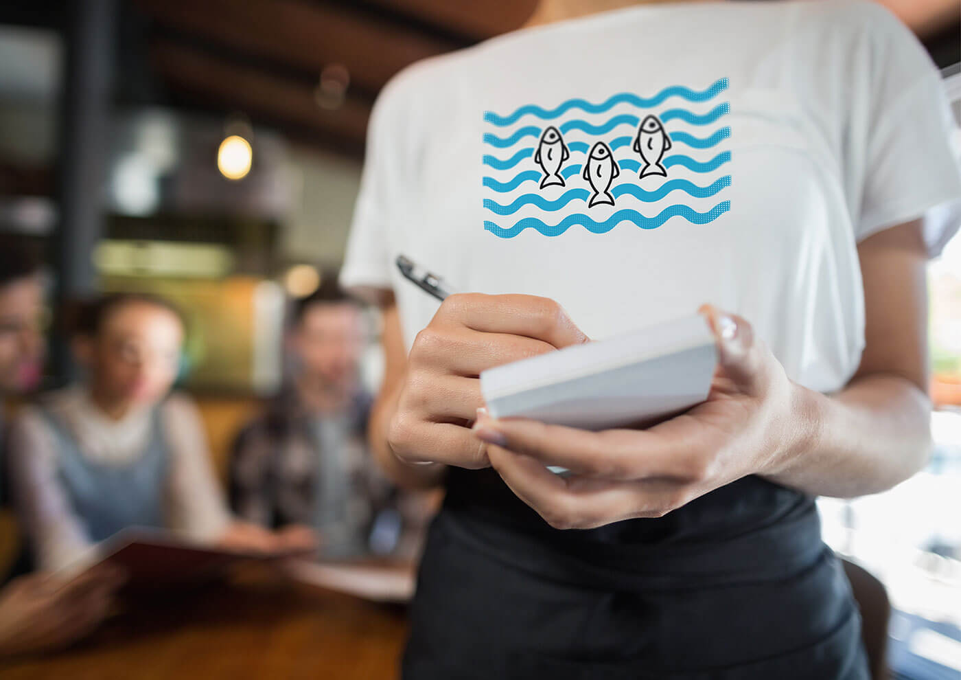
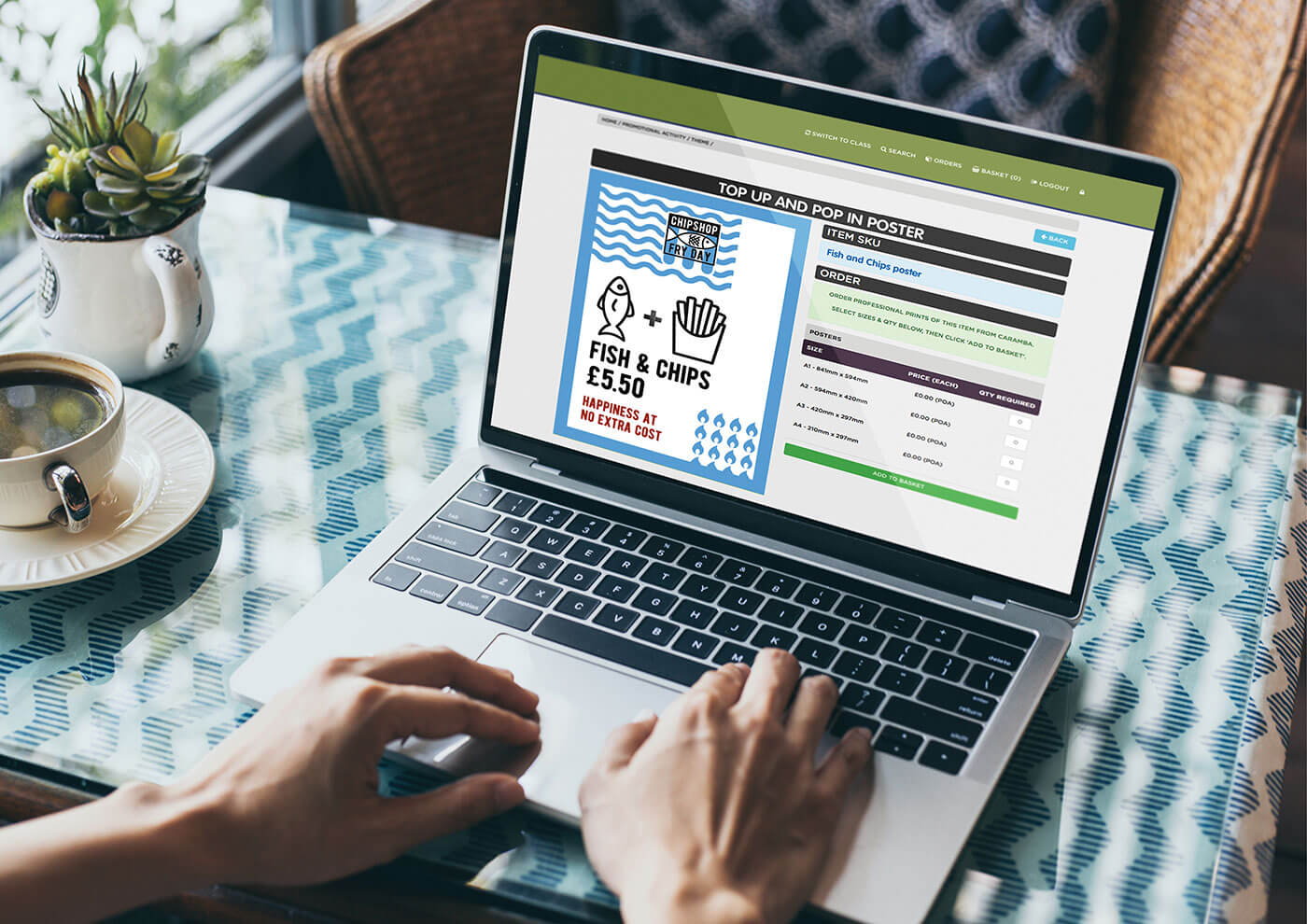
The identity extends far beyond the packaging. Animation, striking photography, merchandise and interior details work together to create a consistent and memorable experience at every touchpoint. Each element supports the same bold visual language, giving Chipshop Fryday a brand that feels as lively and inviting as the food it serves.
Take a look at the finished brand in action.